


The Beginner’s Alphabet is the sloped print script Queensland schools use when children first learn to write, usually from Prep to about Year 2. It was designed so that adding small entry and exit strokes later turns it into Queensland Modern Cursive with very little relearning: the Department’s handbook lists f and z as the only letters that change shape. Joined writing follows from around Year 3, in line with the Australian Curriculum.
Where the Beginner’s Alphabet comes from
The style was set out in The Teaching of Handwriting: a handbook, published by Queensland’s Department of Education in 1984 after a primary handwriting curriculum project trialled the methods and scripts in state schools. One of its stated aims was to introduce a basic print script that leads directly to cursive once entry and exit strokes are added.
The handbook gives its reasons plainly. The letter shapes grow out of the natural scribble movements young children already make. Letters that are easy to confuse, like b and d or p and q, get different movements and features. Starting points also stay consistent, and saying them aloud reinforces them.
The alphabet still underpins the Department’s resources. Its QCursive resource for lower primary includes a Beginner’s Alphabet font (QBeginners) and a Queensland Modern Cursive font, and more recent Department materials, such as a 2018 Beginner’s Alphabet chart with numbered starting points and a 2016 Year 2 handwriting book, use the same letters.
What the Beginner’s Alphabet looks like
Three rules describe most of the alphabet. Every letter slopes. Almost every letter starts at the top: e is the exception, beginning in the middle, and d starts at the top of its round body like an a before going up to its tall stroke. And the pencil doesn’t lift inside a lowercase letter, except to add a dot or a crossbar.
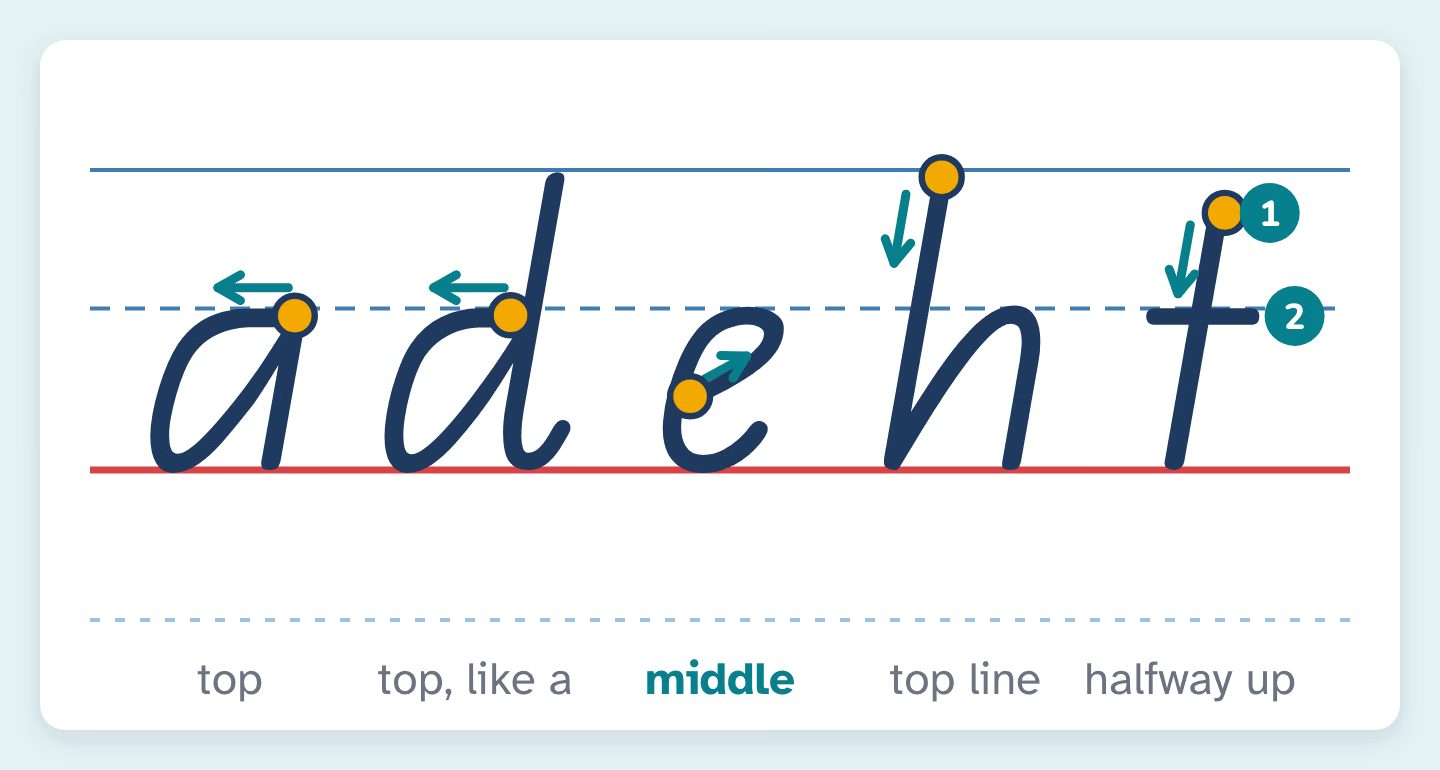
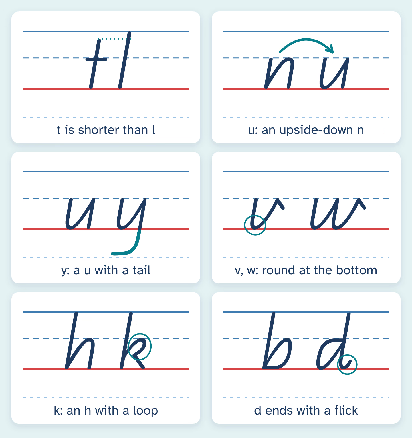
Some letters look different from the print in picture books, and these are the ones children (and parents) most often get “wrong”:
- t starts halfway between the top line and the middle line, so it is shorter than b, h or l. Then a short crossbar goes on after the downstroke.
- u is an upside-down n, so it finishes with a straight downstroke on the right.
- y is a u with a tail. It isn’t made from two straight slanting lines.
- v and w are rounded at the bottom and finish with a short, straight stroke at about 45 degrees.
- k is made like an h, but with a loop tucked in where the hump would be.
- d finishes with a small flick, which helps tell it apart from b.
- c and e are based on an oval with a flatter top and a fairly straight back.
Capitals slope the same way as the lowercase letters. The Department’s 2018 chart shows every capital and lowercase letter, and the numerals 0 to 9, with numbered strokes and directions, and it is the best single page to keep beside the kitchen table.
Heads, bodies and tails
Queensland handwriting materials often describe letters by their parts. The handbook calls a, c, e, m and u “body” letters, b, d, h, k, l and t “head and body” letters, and g, j and y “body and tail” letters. Once joining starts, f becomes the one letter with a head, a body and a tail.
The handbook describes the writing lines by colour, with the body between blue lines and heads and tails reaching red lines above and below. NeatPencil’s QLD Beginners style name tracing sheets show the same three spaces with a top line, a dashed midline, a baseline and a tail line. Bodies sit between the dashed midline and the baseline, heads reach the top line and tails drop to the tail line.
The Department’s Year 2 book turns this into simple self-checks children can use on their own writing: do the body letters touch the middle line, and does the tail of the y reach the bottom line? Those two questions catch most sizing problems.
Patterns and wedges
Queensland teaching materials practise letters on top of patterns, because many letters share a movement. The Department’s Year 2 book uses two:
- The humpy pattern, which looks like a caterpillar, for m, n, r, h, p, b and k. Say “down, up and over” as your child draws each hump.
- The scooped pattern, which goes down, makes a quick turn and comes up, for a, c, d, e, g, o, q, u, v, w and y.
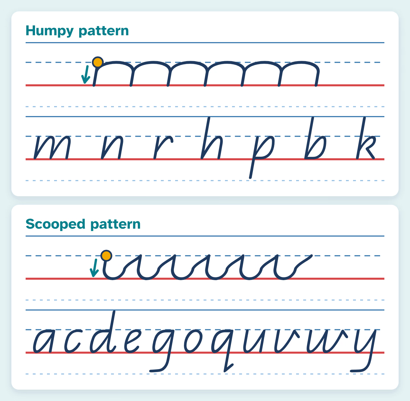
You’ll also hear about wedges. A wedge is the narrow, pointed space where two strokes of a letter meet: where the hump of h or n springs out of the downstroke, or where the round part of a or d meets its straight line. The Year 2 book points them out in letters such as h, n, m, r, p, b, a, d, g, q, u, w and y. A clear wedge shows the letter was made in one smooth movement, and colouring the wedges in a few words is a quick, enjoyable way for children to look closely at their own letters.
Prep to Year 3: what happens when
Queensland schools follow the Australian Curriculum, which describes handwriting year by year without naming a style:
- Prep (Foundation): form most lowercase and capital letters using the formations they’ve been taught.
- Year 1: write words using unjoined letters.
- Year 2: write words legibly and with growing fluency, still using unjoined letters.
- Year 3: write words using joined letters that are clearly formed and consistent in size.
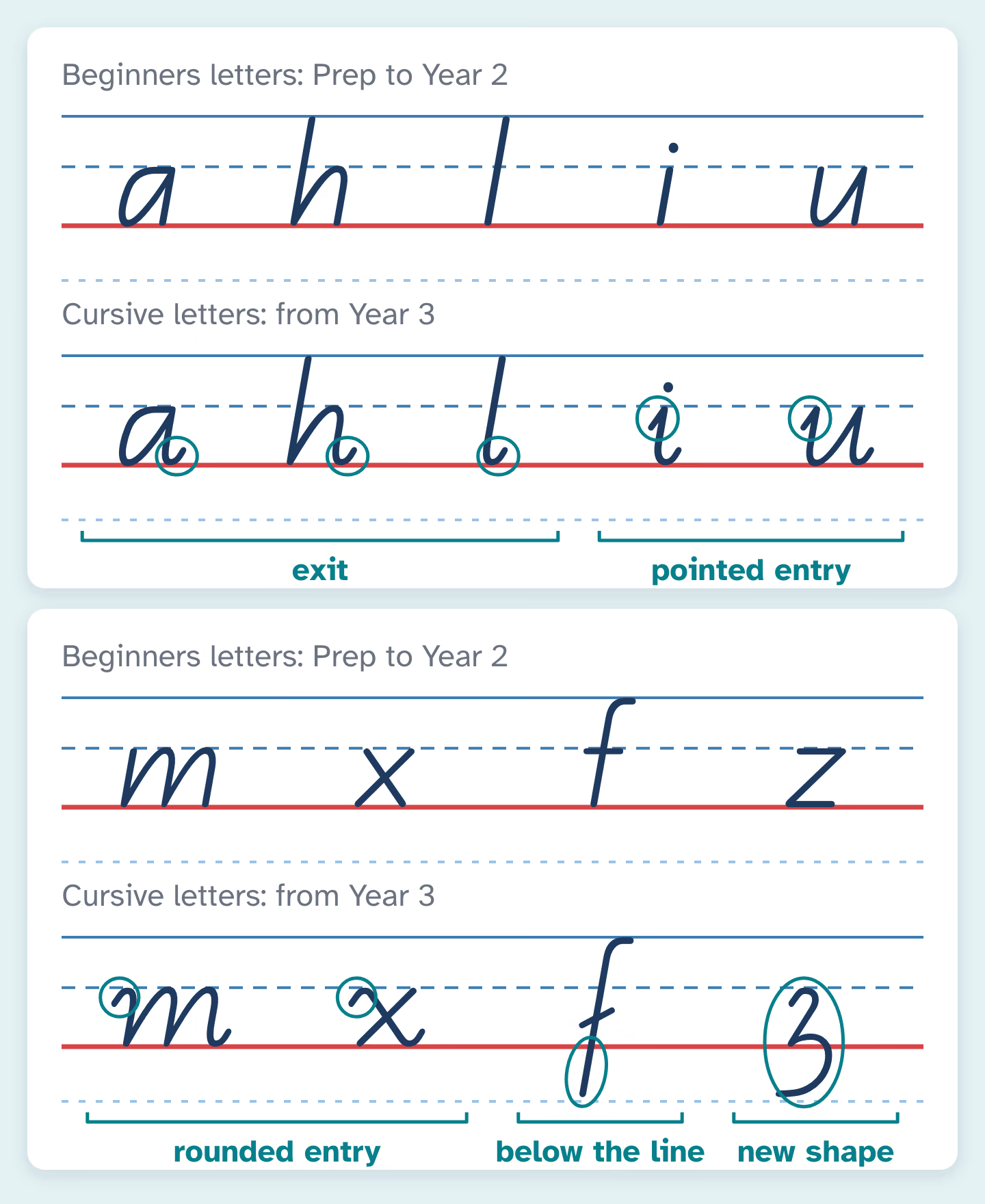
The move to Queensland Modern Cursive mostly adds strokes rather than changing letters. In the handbook, a, h and l gain an exit made with a quick change of direction, i and u gain a short pointed entry, m and x gain a rounded entry, the crossbar of t lifts slightly, and f extends below the line. Schools choose exactly when to start this within their own program, so some begin adding exits earlier than others.
Helping with the Beginner’s Alphabet at home
Five or ten minutes is plenty. Sit beside your child, write the letter first while saying the movement, then watch them write it. For a Prep child, try this order for a new letter:
- Draw it big in the air together, saying the movement.
- Trace it with a finger on the chart.
- Trace it in pencil a few times, starting at the dot.
- Write it once or twice without a model, then circle the best one.
Names are a good place to start because children see them every day. NeatPencil’s sheets put an example row, tracing rows and blank rows on each page, with options for dotted-outline letters and a name and date line, on A4 or US Letter. The font is openly licensed and modelled on the Queensland style rather than being the Department’s own font, so compare a page with your school’s chart.
If your family has moved from another state, don’t panic about a different alphabet. The handbook advises against pressuring a newly enrolled child to change a style that is neat and legible, and suggests changes only where the child is having problems.
When something goes wrong
- A straight-line y. Children copy the y they see in books. Show them the u first, then add the tail: “It’s a u that goes for a swim.”
- A t as tall as an l. Mark a small dot halfway up the head space and start there.
- An a made as a circle plus a stick. That needs a pencil lift the style avoids. Practise the scooped movement: around, back up to the start, then straight down without lifting.
- Letters leaning backwards. Check the paper first. A page tilted the wrong way for the writing hand often pulls the slope backwards.
- b and d swapping. Point to the flick: d has one, b starts at the top of its head. Our guide to letter reversals explains why these mix-ups are normal for a while.
Questions
Is the Beginner’s Alphabet the same as Queensland Modern Cursive?
No, but they are closely related. Queensland Modern Cursive is the Beginner’s Alphabet with entry and exit strokes added, plus new shapes for f and z. Children use the Beginner’s Alphabet first and join later.
Why do the letters slope?
The handbook states that all letters in both the print and cursive styles are sloped. Learning the slope from the start means children don’t have to change it when they begin joining.
Can parents get the Queensland fonts?
Yes. The Department’s QCursive resource on the Learning Place includes the QBeginners and Queensland Modern Cursive fonts for Windows and Mac, along with handwriting activities for Years 1 to 3, and the page opens without a login.
My Prep child writes their name in capitals. Should I worry?
It’s very common. Teach the capital first letter followed by lowercase letters, which is how they’ll write their name at school. Our guide on capital or lowercase letters first explains the thinking.
Sources
- Department of Education, Queensland: The Teaching of Handwriting, a handbook (1984)
- Department of Education, Queensland: QCursive, a Queensland handwriting resource for lower primary
- Department of Education and Training, Queensland: Year 2 Handwriting Book, Unit 1 (2016)
- Department of Education, Queensland: Beginner’s Alphabet handwriting chart (2018)
- ACARA: Australian Curriculum Version 9.0, English scope and sequence F–10


