


Most US schools teach print first and add cursive later. The print is usually one of two kinds: upright ball-and-stick letters built from circles and straight lines, or slanted D’Nealian-style letters with small tails that lead into cursive. Cursive, where the letters join, typically starts in second or third grade, but the timing is set by your state and district, so the quickest way to know is to look at what comes home and ask the teacher.
What each style looks like
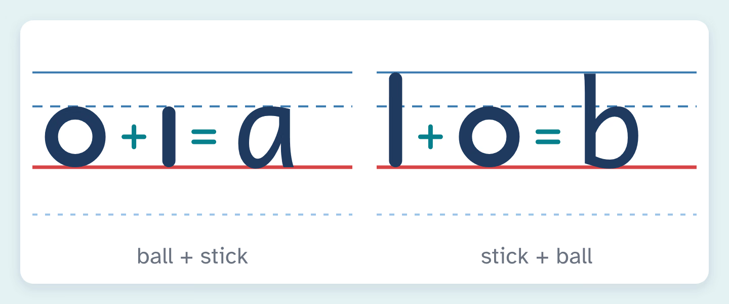
Ball-and-stick print (often called traditional manuscript) stands straight up and looks a lot like the type in a picture book. A lowercase a is a circle with a short straight line beside it. A b is a tall line with a circle at the bottom. Some programs build letters from separate strokes, so children lift the pencil between the “ball” and the “stick.” Others keep the same upright shapes but teach most letters in one continuous movement, with fewer pencil lifts.
D’Nealian-style print leans gently to the right. It was developed by Donald Thurber, a first-grade teacher in Michigan, who started work on it in 1965. Nearly every letter is made in one continuous stroke, and many lowercase letters finish with a small tail. The result is a print a that looks like a cursive a that hasn’t joined anything yet. That’s the point of the design: when cursive arrives, children add joins to letters they already know.
Cursive joins the letters within a word and slopes to the right. Traditional US cursive has looped tall letters such as l, b and h, and some capitals look quite different from their print versions.
How to tell if your child’s school uses ball-and-stick, slanted print or cursive
You rarely need to guess. Teachers model the school’s style all day, so the evidence is usually on the walls and in the backpack.
- The alphabet strip. Many classrooms have one above the board or taped to desks. Snap a photo at back-to-school night.
- The handwriting book or practice pages. The program name is often printed on the cover or footer, and the model letters show the slant.
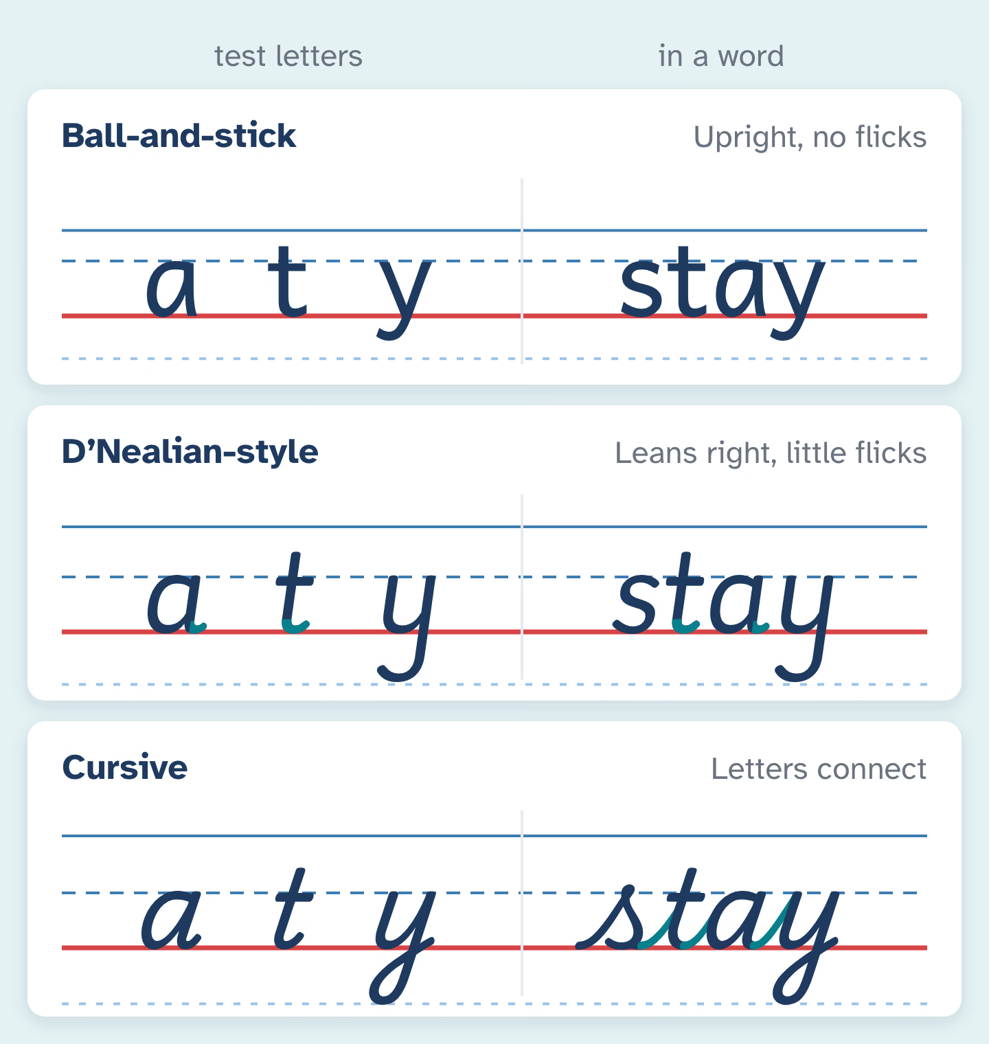
- Three test letters. Look at a, t and y on anything the teacher wrote. Upright with no tails means ball-and-stick. A lean to the right with little flicks at the end means D’Nealian-style. Letters that connect mean cursive.
- A direct question. “Which handwriting program do you use, and is the print upright or slanted?” Teachers are glad to be asked, because it means practice at home will match.
If your district publishes its curriculum online, the English language arts page may name the handwriting program for each grade. Ask about cursive too: which grade starts it and whether it continues after one year.
Slanted print or ball-and-stick: what the research says
The case for slanted print is the smoother move to cursive. Schools that adopted it also reported anecdotally that children reversed b and d less often. The case for upright print is that it matches what children see every day. One author of a rival upright program put it simply in a 1993 Education Week article: the letters in books, on signs and on children’s TV are vertical.
Handwriting researcher Steve Graham, writing for the American Federation of Teachers, says research doesn’t give a definitive answer on which script is more effective. His own advice is to start with traditional upright print, for four reasons: many children arrive at kindergarten already knowing some upright letters, there is some older evidence that it is easier to learn, once mastered it can be written about as fast as cursive and possibly more legibly, and it matches the print children read. A 2023 California legislative analysis quotes a research review reaching the same open verdict on print versus cursive.
For a parent, the practical takeaway is reassuring. Any of these styles works when it is taught clearly and practiced often. What helps most is that home matches school.
When cursive comes in, and what the standards say
Graham describes the usual US pattern as print introduced in kindergarten or first grade and cursive in second or third grade. The national Common Core standards only cover print: first graders should “print all upper- and lowercase letters.” Cursive was left out of Common Core, so states that want it have added it themselves.
Two examples show how specific that can get. California’s state standards ask third graders to write legibly in cursive or joined italics, and a law signed in October 2023 (AB 446) says handwriting instruction in grades 1 to 6 must include cursive or joined italics in the appropriate grades. Texas’s standards ask second graders to form all cursive letters, using the right strokes to connect them.
Other states have their own rules, and some leave the decision to districts. If cursive matters to you, check your state’s English language arts standards or ask the school which grade teaches it.
Matching the style at home, from ball-and-stick to cursive
Once you know the style, use it for everything you write for your child: labels, lunchbox notes, the name on a drawing. Children copy what they see. For practice sheets, our name tracing worksheets in upright print, slanted print or cursive let you pick the same style, and the letter tracing maker covers the alphabet. The fonts are openly licensed fonts modeled on each style, not official program fonts. D’Nealian and Zaner-Bloser are trademarks of their owners, and NeatPencil isn’t affiliated with either.
Say the movement out loud as your child writes. Keep the words short enough to finish while the pencil moves.
- Ball-and-stick a: “Circle back around, then a straight line down.”
- Slanted a: “Around, up, down and a little tail.”
- Ball-and-stick n: “Start at the middle line, go down, back up and over.”
- Cursive a: “Swing up, curve back around, close it, down and swing out.”
Watch where each letter starts and which way the pencil travels. A neat letter made backward will cause more trouble later than a wobbly letter made the right way. Short, frequent practice beats long sessions: Graham suggests short lessons several times a week or daily, adding up to 50 to 100 minutes a week from kindergarten through third grade. Have your child circle their best letter on each row, so the focus stays on quality.
When the styles don’t match
Preschool taught one style and kindergarten teaches another. This is common, because the letters children learn from parents and preschool teachers are usually upright. Graham points out that a slanted program means relearning letters children can already write. Don’t try to change everything at once. Keep the letters that already match, then switch the others a few at a time, starting with the ones in your child’s name.
You change schools. Ask the new teacher whether they expect a switch. Some are happy for a child to keep a consistent, legible print in the old style, while others will want the change made.
Your child mixes upright and slanted letters. Pick the school’s style and stick to it at home. A ruler line drawn at a slant along the page can remind a slanted-print writer which way to lean.
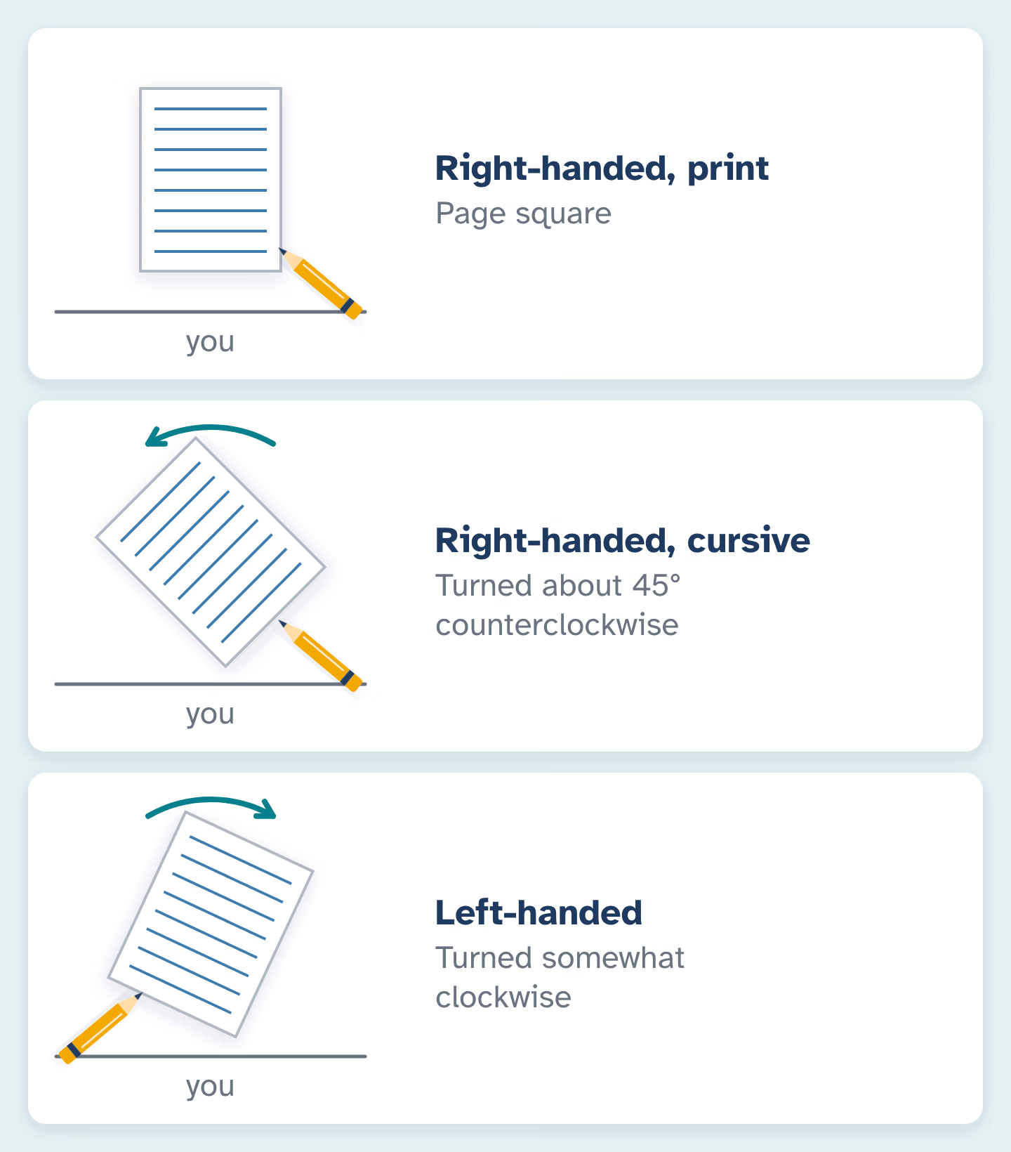
Cursive feels awkward. Check the paper first. Graham advises right-handers to keep the page square for print but turn it about 45 degrees counterclockwise for cursive, while left-handers turn it somewhat clockwise. Our guide to helping left-handed children write comfortably covers the rest. And expect some drift: Graham notes that every child eventually develops a personal style, and insisting on a perfect copy of the model tends to frustrate everyone.
Questions
Is slanted print harder for a child who already knows ball-and-stick?
Expect a period of adjustment, mostly for letters like a, d and t where the tail is new. Most children manage the change well when home and school use the same style.
Should I teach cursive at home if the school doesn’t?
You can, once your child prints every letter correctly and comfortably. Reading cursive and signing a name are useful skills. Keep sessions short and use a standard model so the letters stay consistent.
Can children skip print and start with cursive?
Some schools in other countries do this, and some educators recommend it. Research hasn’t settled whether it is better. In US schools, print first is the norm, so following your school keeps things simple.
Why does my child’s cursive look different from mine?
Programs differ in small details, such as the shape of some capitals and where the loops and joins go. Your child’s school model is the one to follow for homework.
Sources
- Steve Graham, “Want to Improve Children’s Writing? Don’t Neglect Their Handwriting,” American Educator (AFT), Winter 2009–2010
- Education Week, “A New Slant on Penmanship” (1993)
- Common Core State Standards: Language, Grade 1
- California Assembly Committee on Education, analysis of AB 446 (2023)
- CalMatters Digital Democracy: AB 446 bill status
- 19 Tex. Admin. Code § 110.4, English Language Arts and Reading, Grade 2


